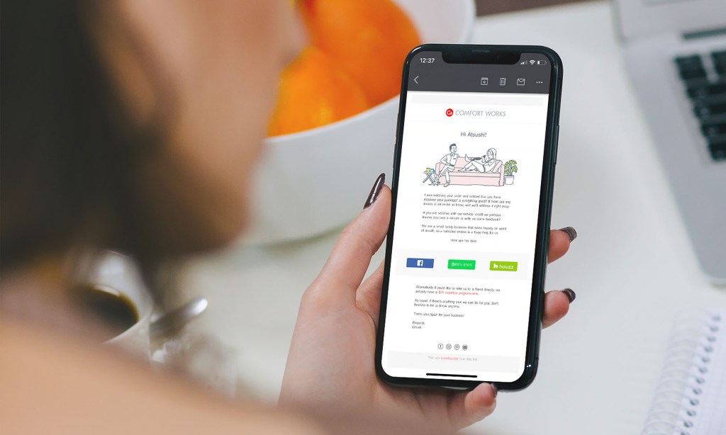
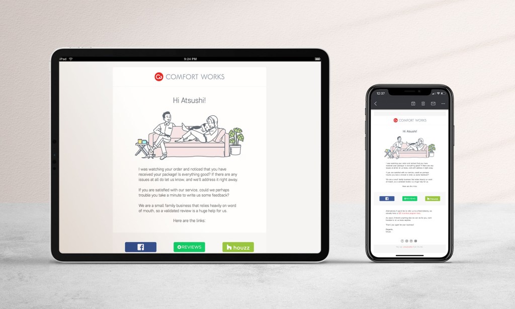
I was given the opportunities to explore on making user experience to feel more…human! Emails are boring, they’re texty and tacky. They easily take up most of what’s above-the-fold — where the real estates are. Visual driven emails also seem spammy triggering low CTR and email opening rate. Do users even want to load up that email if the image itself is heavy? How do we leverage that? Looks good on desktop but constrained on mobile?
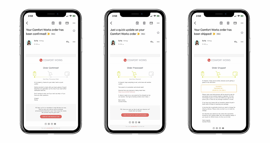
2. Order Processed lets the customer know that their order is being actioned since the initial stage.
3. Order Shipped last but not least, one that get people excited to acknowledge their package whereabouts.

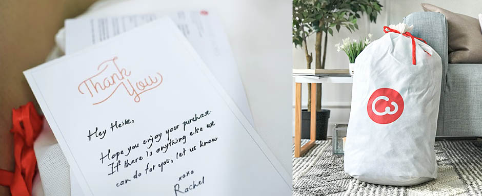

The sheets were then processed digitally. Rob; the ass-kicking back-end developer, and I, worked on a module that generates random choice of alphabets to make the handwriting as seamless and natural as possible.
The module then generates the template out once an order gets through. Our colleagues in Shenzhen, China, then receive the printouts upon order confirmed.
